Michael Simes was referred to me by a mutual friend, Chris Clarke, who just so happens to be a very talented cartoonist (seriously—check him out). When Mike came to me to help him design a brand identity and website for Lion’s Breath Diving, a diving outfit dedicated to interactive education, after-school programs, open water training, and luxury, family-friendly dive travel, he had a very cool custom illustration Chris had created, but otherwise gave me lots of creative freedom. LBD’s mission is to engage and nurture the next generation of divers and ocean lovers. Because children and families are their key demographic, I was delighted to get to run with the design directive of bold whimsy and playful fun.
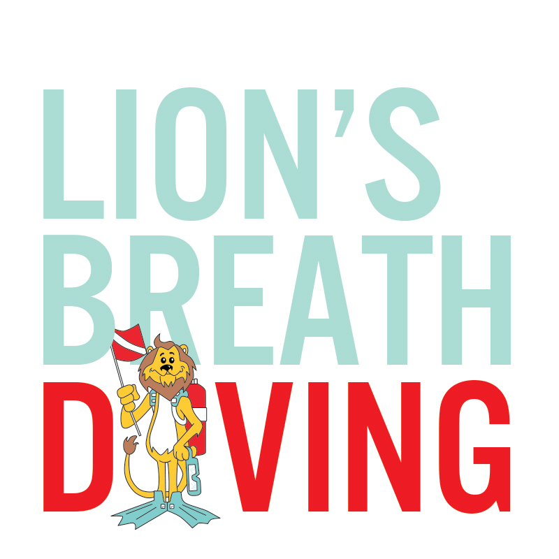
For the website, we digitized Chris’s lion and I “redressed” him to represent the the four main services LBD offers (which was a lot of fun to do!).
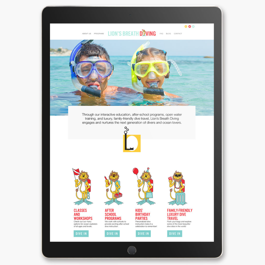
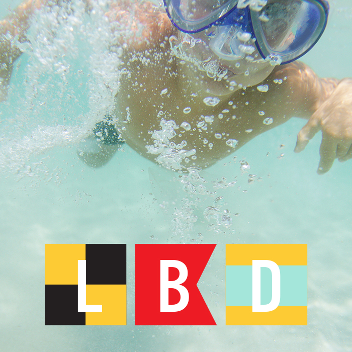
During the logo design process, clients are typically presented with a few options, then we narrow down and refine. The rejected designs are usually filed away and eventually forgotten, but Mike liked everything so much we instead figured out a way to work a couple of the other concepts (dive flags and dive-inspired icons) into our toolkit and are using them throughout the site and on marketing and branded materials like hats, shirts, and even on a tent! Because the colors and styling are consistent with the core brand identity design, they work.
![]()
If you love water, ocean exploration, have ever dreamed of diving, are young, or just young at heart, check out Lion’s Breath Diving’s offerings.
On that note, Michael is currently raising money to fund LBD and is offering some of his very cool dive training and courses, as well as a diving/sailing/yoga retreat in the Spanish Virgin Islands(!), as rewards for donating to the Lion’s Breath Diving GoFundMe campaign. Check it out and get your dive on here.